Choosing a countertop color is easier when you stop judging the countertop by itself. The best countertop color is one that works with the finishes already in the room- especially cabinetry, flooring, backsplash, lighting, and any architectural elements that are staying. Start with the least flexible parts of the kitchen, identify whether their undertones are warm, cool, or neutral, then decide whether you want the countertop to blend in, create contrast, or become the focal point. That approach turns a huge field of attractive materials into a much more manageable selection.
Start With What Is Already Fixed
Before comparing countertop colors, identify the parts of the kitchen that are not changing. In an existing home, that may include:
- Cabinetry you plan to keep
- Hardwood or tile flooring
- Appliances
- Wall colors
- Fireplace stone or nearby architectural finishes
- Flooring that continues into an adjoining open-plan space
These elements create the palette your new countertop needs to work with. If you are starting a complete remodel or new build, you have more flexibility. Even then, it helps to establish one or two major design anchors first instead of choosing cabinets, countertops, flooring, and backsplash independently.
For many homeowners, the countertop becomes one of those anchors because it occupies a large horizontal surface and can introduce color, pattern, movement, and texture. When comparing materials for new kitchen countertops, bring samples of any finishes that are staying whenever possible. Materials are much easier to evaluate when they are viewed together.
Learn to See Warm, Cool and Neutral Undertones
Two surfaces can both be called white, gray, or beige and still feel wrong together. Often, the issue is undertone. A white countertop may lean warm and creamy, cool and blue-gray, or fairly neutral. Gray cabinetry can carry blue, green, brown, or violet undertones. Natural wood introduces warmth through red, yellow, or golden tones.
The goal is not to make every undertone identical. It is to understand what is already present so new materials do not unintentionally compete. For example, creamy cabinets paired with an icy blue-white countertop can make one surface look unexpectedly yellow. A warmer white or softly veined stone may create a more natural transition. Richly stained wood cabinetry, meanwhile, may work well with either a warm stone or a deliberate cool contrast depending on the rest of the room. When in doubt, compare the materials side by side rather than evaluating each one alone.
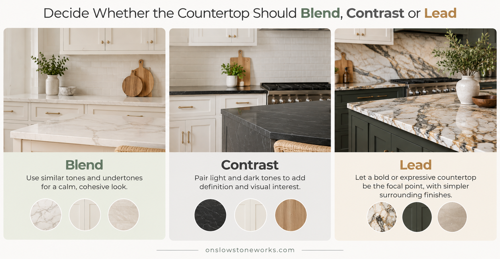
Decide Whether the Countertop Should Blend, Contrast or Lead
Countertops do not need to match cabinets. A better question is: What role do you want the countertop to play in the room?
Blend for a quieter look
Choosing similar values and compatible undertones creates a softer, more continuous palette. White cabinetry with a light countertop, for example, can make a kitchen feel bright and open. The surfaces do not need to be identical. Subtle differences in veining, texture, or tone can add depth without creating a strong visual break.
Contrast for more definition
A countertop can also deliberately contrast with cabinetry. Dark countertops against light cabinets can add structure and definition, while lighter stone can brighten deep green, navy, charcoal, or wood cabinetry. Good contrast does not mean introducing unrelated colors. The materials should still connect through undertone, veining, hardware, flooring, or surrounding finishes.
Let the countertop become the focal point
Some materials deserve more visual attention. A dramatic quartzite, expressive marble, strongly patterned granite, or bold-veined quartz countertop can become the feature around which the rest of the kitchen is simplified. When the countertop has a lot of movement, quieter cabinetry and backsplash choices often give the stone more room to stand out.
Balance Countertop Pattern With the Backsplash
Your countertop and backsplash do not need to match. They need to relate. When both surfaces have strong pattern, movement, or color variation, they can compete for attention. A dramatic countertop often works best with a simpler backsplash, while a quieter countertop gives you more freedom to introduce patterned tile, texture, handmade finishes, or stronger color.
One useful approach is to repeat a secondary tone from the countertop in the backsplash. A warm beige vein, soft gray movement, or subtle accent color can create a connection without trying to reproduce the stone exactly. If you plan to use the same slab material for both countertop and backsplash, the result is more continuous and architectural. The right approach depends on which surface you want to lead.
Make the Flooring Part of the Decision
Flooring is easy to overlook because countertop samples are usually viewed at eye level. But flooring covers a large area and can strongly influence how other finishes appear. Warm oak floors create a very different background than cool gray tile or pale natural stone.
If the flooring is staying, treat it as one of the fixed elements in your palette. Place countertop and cabinet samples near it and judge the combination as a whole. This matters even more in open-plan homes where the kitchen flooring continues into adjoining rooms. A countertop that works with the cabinets but feels disconnected from the wider space may not create the result you want. You do not need every finish to match. Repeating or relating a few tones is usually enough to create continuity.
Consider the Amount of Pattern in the Whole Room
Color is only part of the decision. Countertops also vary in pattern scale, veining, movement, speckling, and contrast. A kitchen with detailed cabinet doors, patterned flooring, decorative tile, and prominent hardware may benefit from a quieter countertop. In a simpler room with flat-panel cabinetry and restrained finishes, a more expressive slab can add character.
Natural materials make this especially important because every slab can vary. When considering natural stone countertops, look beyond a small sample. The full slab may contain broad movement, color changes, or veining that cannot be understood from a few inches of stone. A pattern that looks subtle on a sample can become much more prominent across a large island.
Check the Combination in Your Actual Lighting
A countertop color can look noticeably different at home than it did in a showroom. Natural daylight, warm evening lighting, window direction, wall color, and surrounding cabinetry all affect how a surface reads. Whenever possible, review samples in the room at different times of day. Look at them:
- In natural daylight
- Under your normal evening lighting
- Beside cabinet doors
- Against the flooring
- Near the proposed backsplash
- Horizontally, as the countertop will actually sit
Orientation matters. A finish viewed vertically under showroom lighting may feel different once installed horizontally across a large surface. For natural stone, seeing the full slab is particularly helpful because it reveals movement and variation that a small sample cannot show.
A digital planning tool can also help narrow your direction before you commit. Onslow Stoneworks’ Kitchen Visualizer can help you explore broad combinations of countertop, cabinet, and surrounding finishes before comparing physical materials.
Use a Simple Checklist Before You Decide
Before making your final selection, ask:
- Which finishes are staying?
- Are they predominantly warm, cool, or neutral?
- Do I want the countertop to blend, contrast, or lead?
- Is another surface already strongly patterned?
- Does the countertop work with the flooring?
- Have I compared the samples together rather than individually?
- Have I checked them in both daylight and evening light?
- If I am choosing natural stone, have I seen the full slab?
- Do I still like the combination when I step back and look at the room as a whole?
If those answers feel clear, you are usually much closer to a confident decision.
Bring the Whole Kitchen Palette Together
A countertop does not need to match every surface in your kitchen. It needs to create a relationship between them. Start with what is fixed, pay attention to undertones, decide how much contrast and pattern you want, and evaluate the final combination under the lighting in your own space.
The right countertop should make the cabinetry, flooring, backsplash, and surrounding finishes feel more intentional together—not compete with them. Taking a little extra time to compare the full palette before fabrication can make the difference between choosing a beautiful countertop and choosing the right countertop for your kitchen.